- Connect Everything Newsletter
- Posts
- The XRP Correlation You Can’t Ignore (FLR 👀)
The XRP Correlation You Can’t Ignore (FLR 👀)
You’re going to want to see this…
Yesterday we shared ADA’s correlation and started eyeing a possible FLR pump.
Then @frankvalentich1 dropped a nugget: XRP’s correlation is even tighter showing a 3000% pump is imminent.
Naturally, we had to dig in… 👇
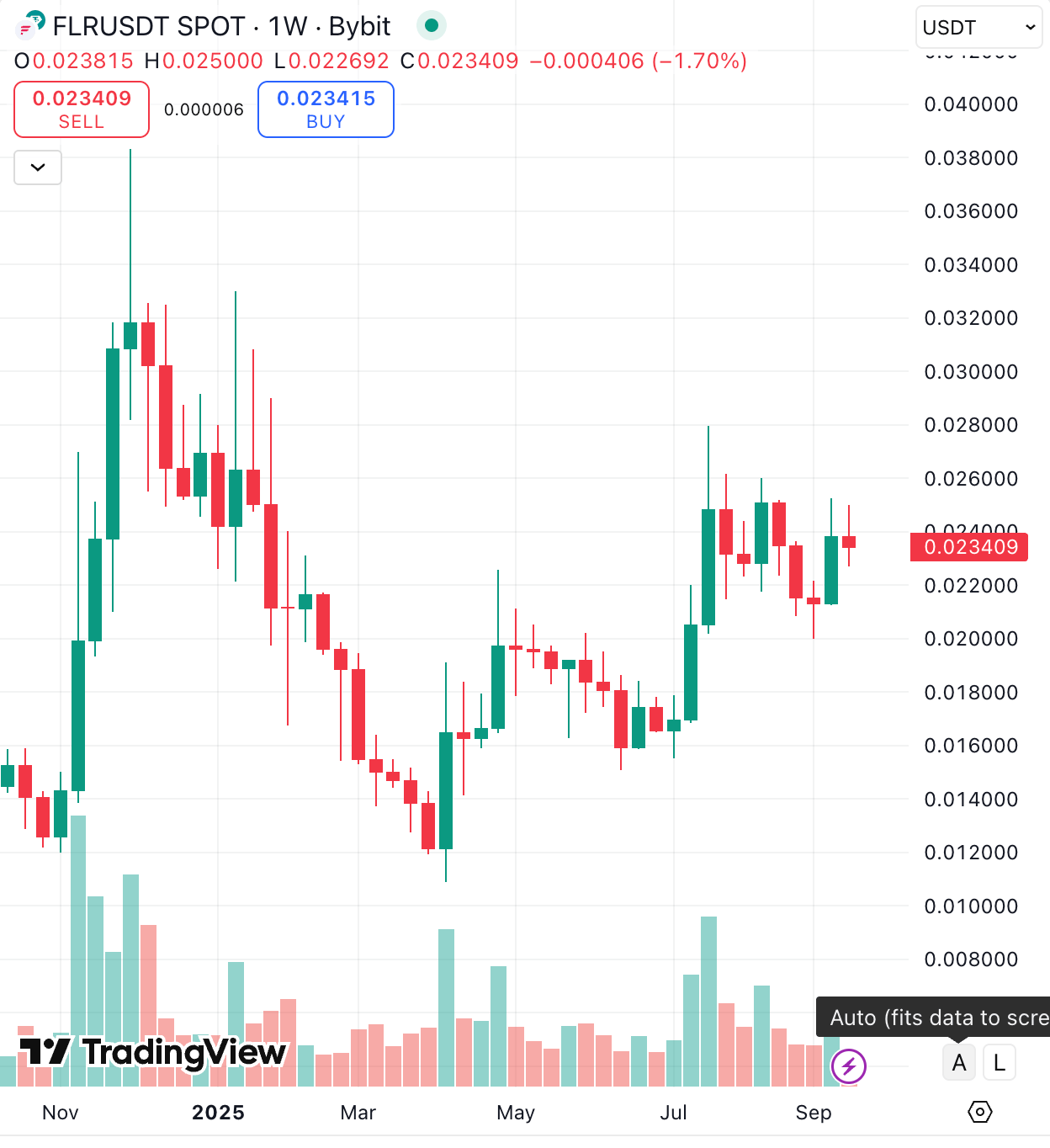
FLR (Flare) Current Weekly Chart
Big selloff, then a long consolidation phase.
XRP Weekly Chart 2017 Bull Run Set Up
Similar structure: heavy initial dump → sideways consolidation → recovery attempt.
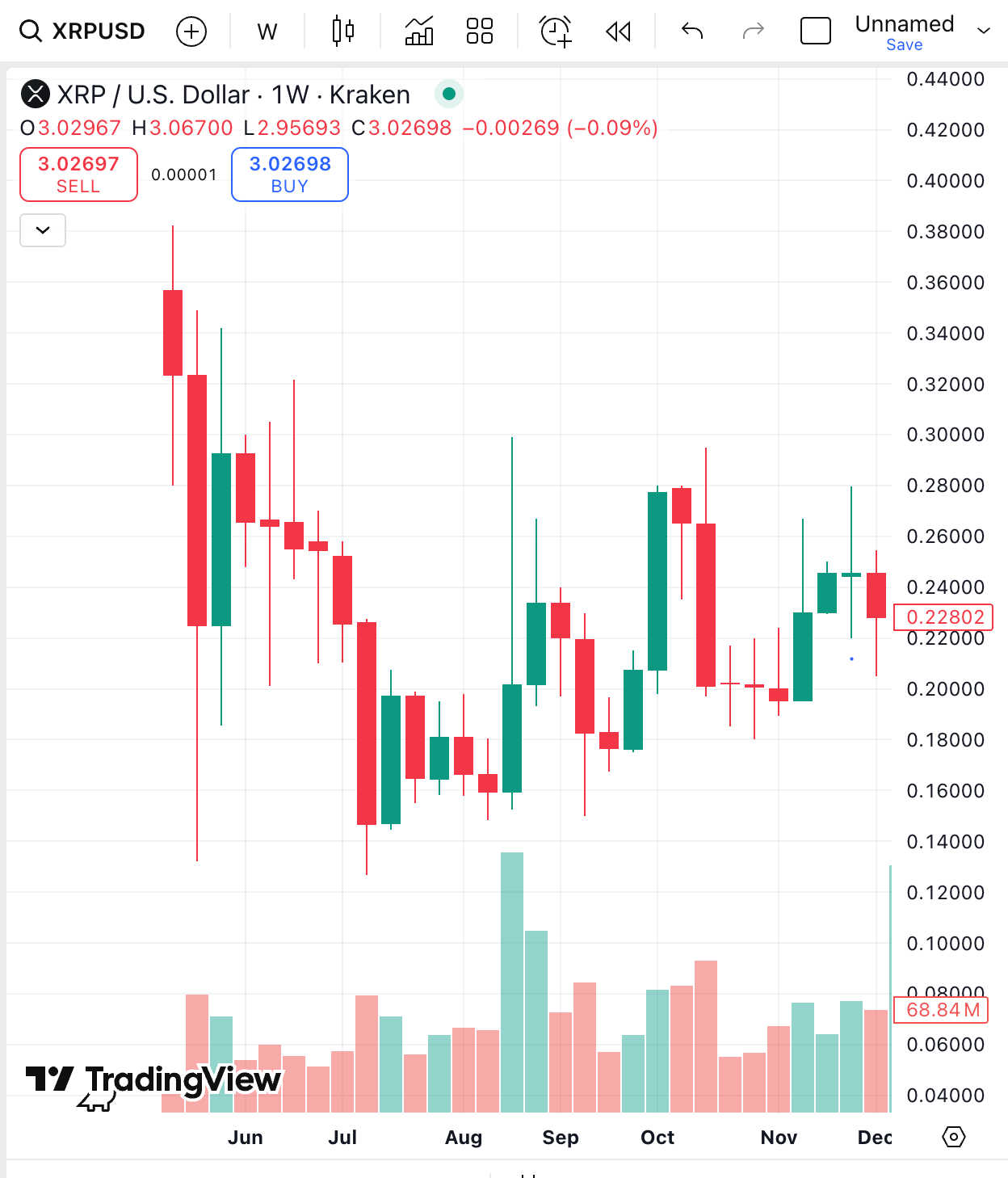
Like FLR, XRP was showing a rounded bottom attempt, with buyers stepping in after months of decline.
The shapes of the charts are strikingly similar:
Initial spike → sharp decline → sideways → recovery attempt.
Both show parallel accumulation ranges followed by attempts at higher highs.
To really see the correlation we need to overlay the structures and apply a normalised price level for both assets.
Here’s the overlay:
Orange line = FLR (normalised)
Blue dashed line = XRP (normalised)
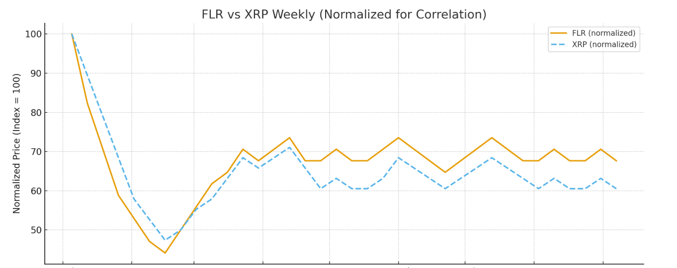
They’re almost identical!
Both charts show the same broad shape:
Early drop,
bottoming formation confirmed by higher lows,
Gradual recovery and sideways accumulation over several months,
Both holding steady near a consolidation band.
This visual confirms the correlation: FLR’s current price action tracks XRP’s 2017 structure closely, though FLR sometimes moves more sharply (higher volatility).
The correlation coefficient between FLR and XRP weekly closes is 0.87 🚀
That’s a very strong positive correlation (ranges from -1 to +1, where +1 is perfect lockstep).
The next weekly candle XRP printed was legendary and started a 3000% pump👇
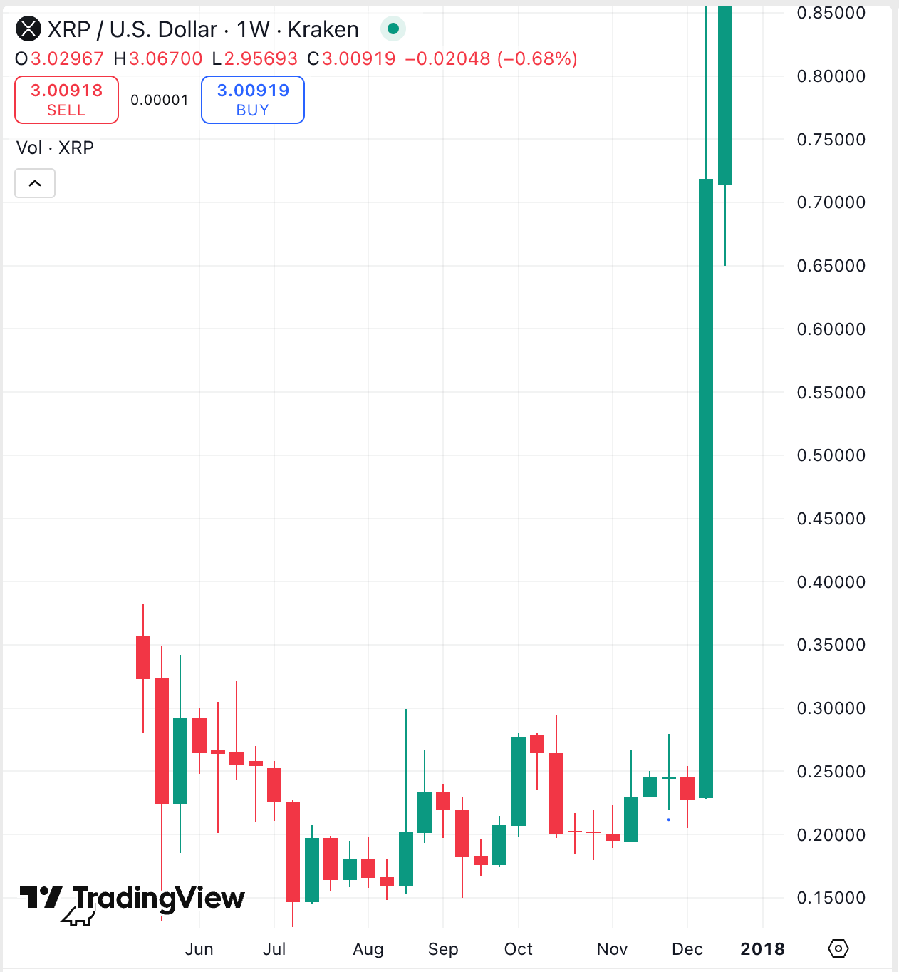
A similar pump for FLR would see $0.70 +
Exciting times as we look forward to Fassets launching and more major partnership announcements…
👊